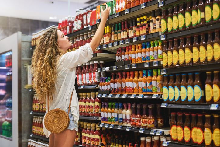
Have you ever been to the grocery store with your list in hand and left with more items than you needed? Was it a deal that was simply too good to miss, or was it because the packaging was unique and stood out to you enough to make you want to try a brand new product? We may not realize it but the box that a product comes in is just as important as the product itself. Unless a brand has been around long enough to establish customer loyalty—it’s important that it visually sets itself apart.
Here are six examples of brands we think are crushing it when it comes to the package design game:
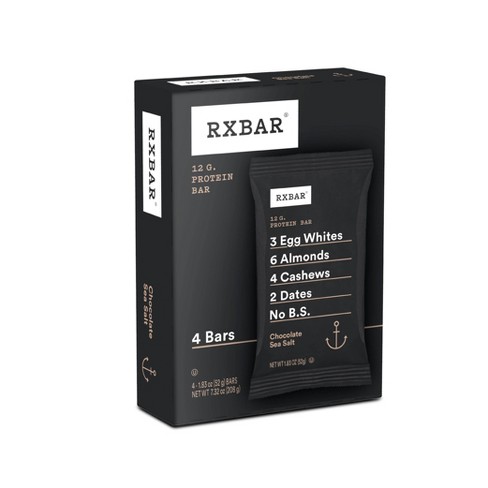
1. RXBAR
One of RXBAR’s main selling points is that their product is simple, with just a few ingredients that everyone recognizes plastered right on the front of their boxes. Much like their list of ingredients, the brand’s packaging also maintains a minimalistic vibe. This is clever marketing as you can tell right away what they’re trying to communicate to the consumer.
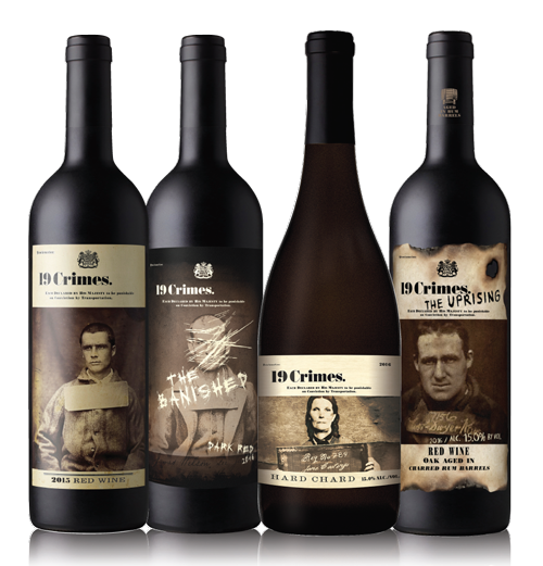
2. 19 Crimes
19 Crimes is an Australian wine brand with a unique twist. Each one of their bottles features a vintage mugshot with a story behind it. Want to know what the criminal did? Simply pull out your phone and scan the label with your camera to discover the story behind the wine. This is a fantastic idea because it encourages the consumer to interact with the product—and picking something up off the shelf to look at it is the first step to getting a customer to put a new grocery item in their cart.
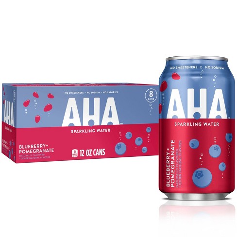
3. AHA
Coca-Cola’s response to the Pepsi product “Bubly” emulated their more colorful approach to the seltzer box design—but AHA added a twist to the aisle by combining two flavors in the same can. The box illustrates this perfectly by utilizing a split design, each half representing one of the two flavors.
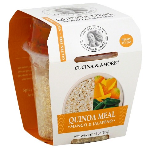
4. Cucina & Amore
Another important thing to think about when it comes to package design is functionality. Cucina & Amore did a fantastic job keeping functionality in mind when they designed their quinoa meals. They created a unique shape to house the quinoa container, and the ingenious slits on the side help keep a small package of sauce in place. Perfect for a lunch on the go!
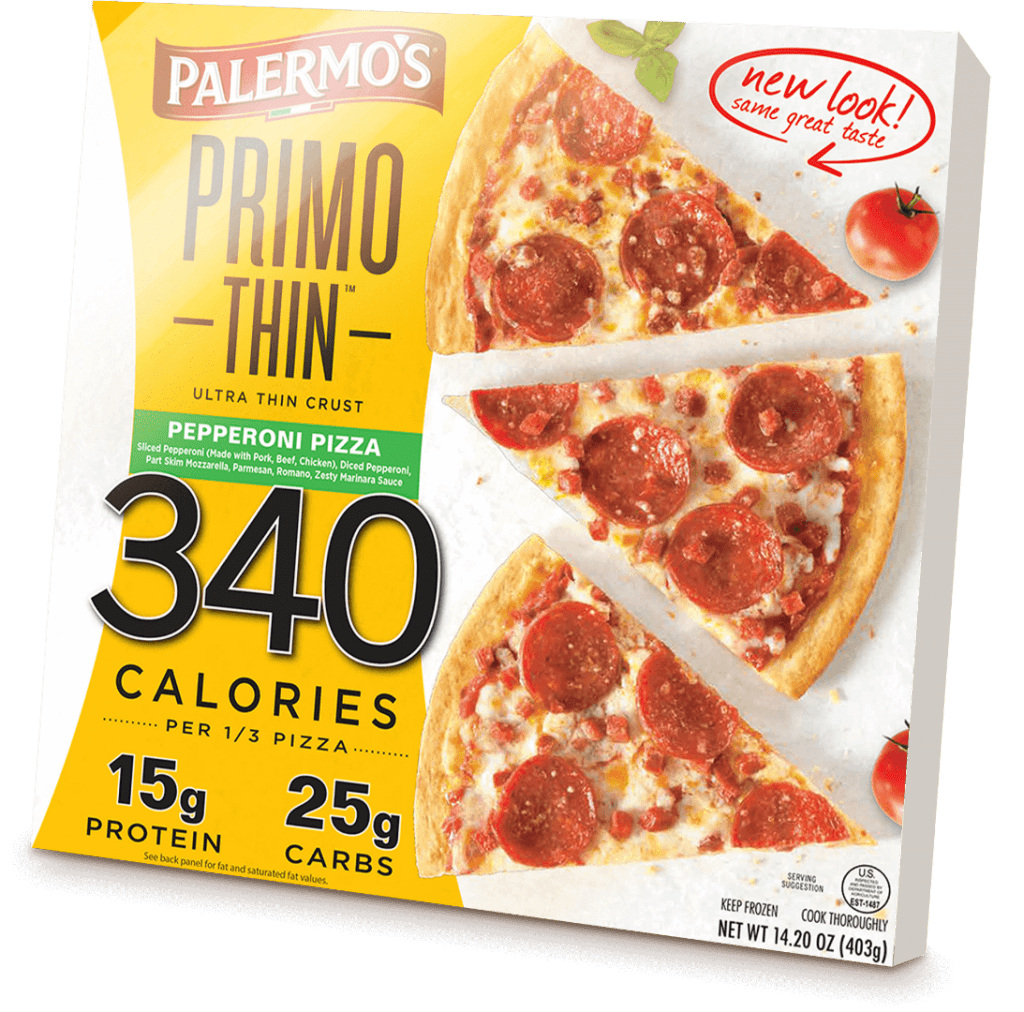
5. Palermo’s
It’s important that companies keep their main consumer base top of mind when designing a box for their product. Palermo’s does this successfully. A lot of people are becoming more health-conscience in recent times, and as a result it has become popular to ideate on healthy (or healthier) alternatives to some of our favorites—like cookies or pizza. In order to appeal to the customer who is on the lookout for something a little less indulgent, Palermo’s calls out their low-calorie count on the very front of their box, almost making it the main focal point aside from the pizza itself. This is a smart marketing tactic to score consumers with an appetite for healthier alternatives to kitchen staples.
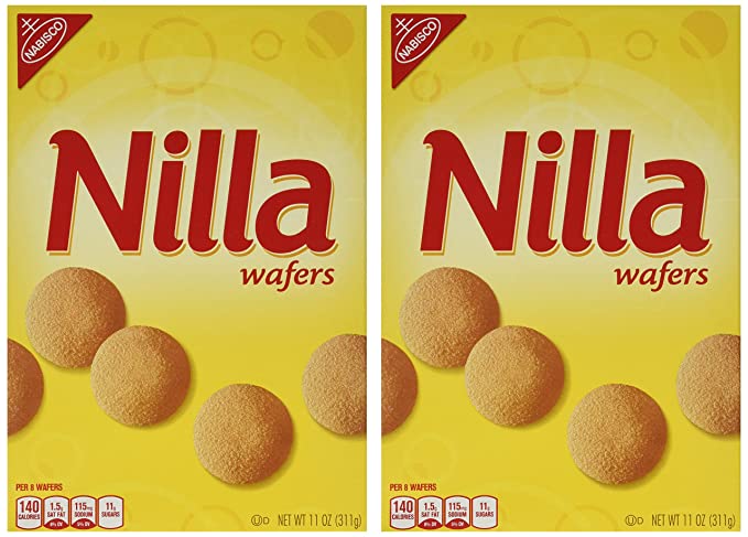
6. Nilla Wafers
Although it’s certainly crucial to think of how a box may appear on its own, it’s also critical to think of how it will present on the shelf. Nabisco Cookies’ Nilla Wafers has clearly thought this out, as their product almost always gets two slots in the grocery store, and you can see that they’ve designed their packaging so that the cookies line up. This creates a continuous image that’s pleasing to the eye