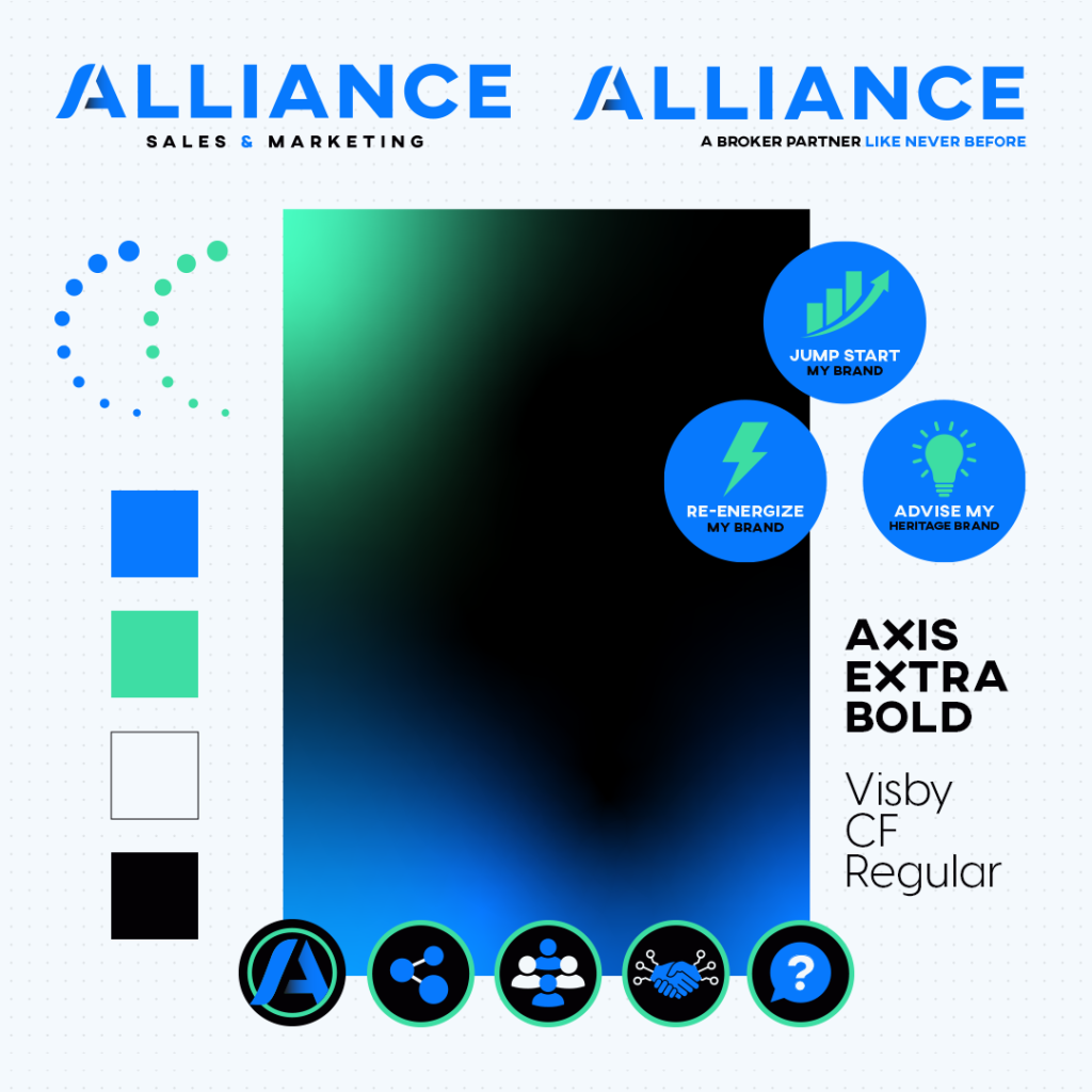
There comes a point where you should ask yourself if your current branding is resonating with your target audience. At Alliance, we asked ourselves that same question; igniting the mission to create our new brand identity. Our marketing team followed a 4D creative process: Discovery, Design, Develop, and Deploy to revamp our website, logo, and color palette.
Discovery
This phase is all about defining the scope, vision, requirements, barriers, motivators, and pain points. We also identified resources, milestones, timelines, and deliverables.
We kicked off the project by sending out an employee questionnaire and preformed a brand audit. Once we collected the information, our Creative Director, Lauren Smith led the marketing team through a full two-day brand workshop and exercises to develop our brand positioning.
We developed a brand pyramid that determined our mission, vision, and value proposition. This was followed by defining our brand messaging pillars, brand attributes, brand voice, target personas, and tagline.
Design
The purpose of a “design” stage is to ensure the tone, visual content, hierarchy, etc. matches a client’s outcome or vision. The foundation of a creative strategy is the brand positioning. Our creative team explored how we would want the overall look and feel of our visual identity to represent Alliance.
Starting with a mood board, we added ideas and inspiration for logos, color palettes, buzzwords, and our website. Discussing as a team what we each liked from the mood board allowed us to build upon each other’s ideas while tying it back to our original brand pillars.
About fifty logo variations with color palettes were developed throughout the discovery phase. The team went through each variation and narrowed it down to their favorites, which led to the development of graphic elements.
We landed on a logo that aligned with our brand positioning and appealed to our target segments, while representing who we are as an organization.
The A represents a partnership, as two pieces come together to form the letter. The forward motion in the logo represents the growth potential in the brands we represent. The bolder blue nods to being future forward while evoking the feeling of trustworthiness. Altogether, this formed a sophisticated, polished look for our brand.
Following the development of our logo, we built a toolkit that included colorways, primary and secondary color palettes, illustrations, social icons, and fonts. Using the toolkit, we began creating the new website. In conjunction with the website, we developed out additional sales and branding collateral using our new look.
Alliance is more than just a broker; we’re brand builders, results driven, and future forward. We’re strategic with a track record of going above and beyond for our clients, while growing brands like never before.
Something you may hear our CEO Scott Anderson say is what makes Alliance is our people and relationships with others in the industry. Over the years, Alliance has gained success through word-of-mouth referrals that speak to the passion and enthusiasm we have for our clients. The video on our homepage on the website features Alliance team members, not actors. The brand videos, leadership team videos, and behind-the-scenes content showcases who we are as an organization, our values, and our mission.
If you’re interested in learning more on how the Alliance Marketing team can re-energize your brand, visit alliancemarketing.com.


