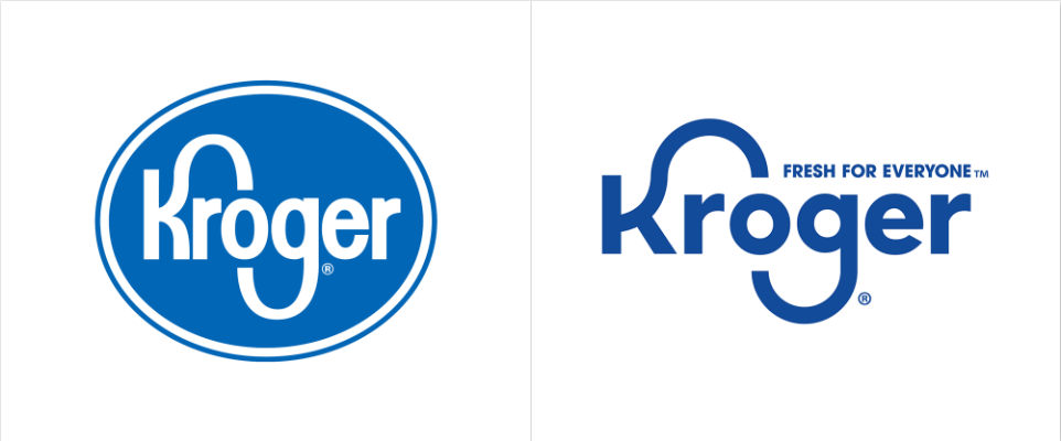
Last month, The Kroger Co. debuted their new logo and slogan, “Fresh For Everyone.” They are re-positioning their brand identity to focus on their “Food First” culture initiative.

New Mixed With the Old
Being that Kroger is one of the largest and oldest grocery retailers nationally, they still wanted to maintain some element of their established identity. The blue color stayed consistent in their revised logo to maintain their brand heritage of food savvy, safety, and trust to customers. They also kept their elongated “K” & “G” in their logo, loved by many consumers nationwide.
Mandy Rassi, Kroger’s VP of Marketing, stated “Kroger’s new brand celebrates our love of people and our love of food, cutting through the ‘sea of sameness’ that has beset grocery retail advertising for far too long. Having a more consistent and recognizable brand enables Kroger to stand out and engage our customers in an even more compelling way.”
This change has gotten a lot of traction in media and news outlets due to Kroger’s widespread marketing efforts. From video commercials to advertisement graphics to a total website revamp—Kroger has utilized all aspects of their marketing landscape.
Fresh For All Audiences

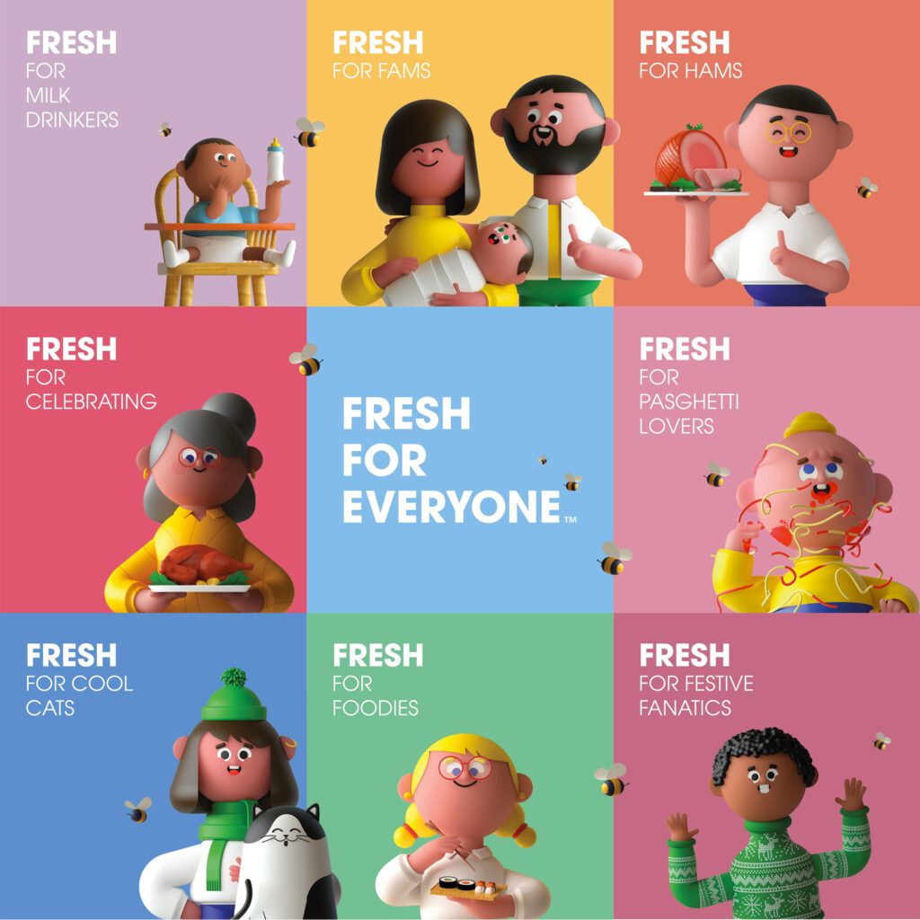
Kroger took their rebranding a step further by creating additional visual elements for their consumers to connect with—say hello to “Krojis” (Kroger Emojis). Krojis represent all the various customers that shop at Kroger. The characters represent a variety of people, from the party host to the home cook. Kroger wants their consumers to know they have all the options to fit their individual needs and in a fresh way.

